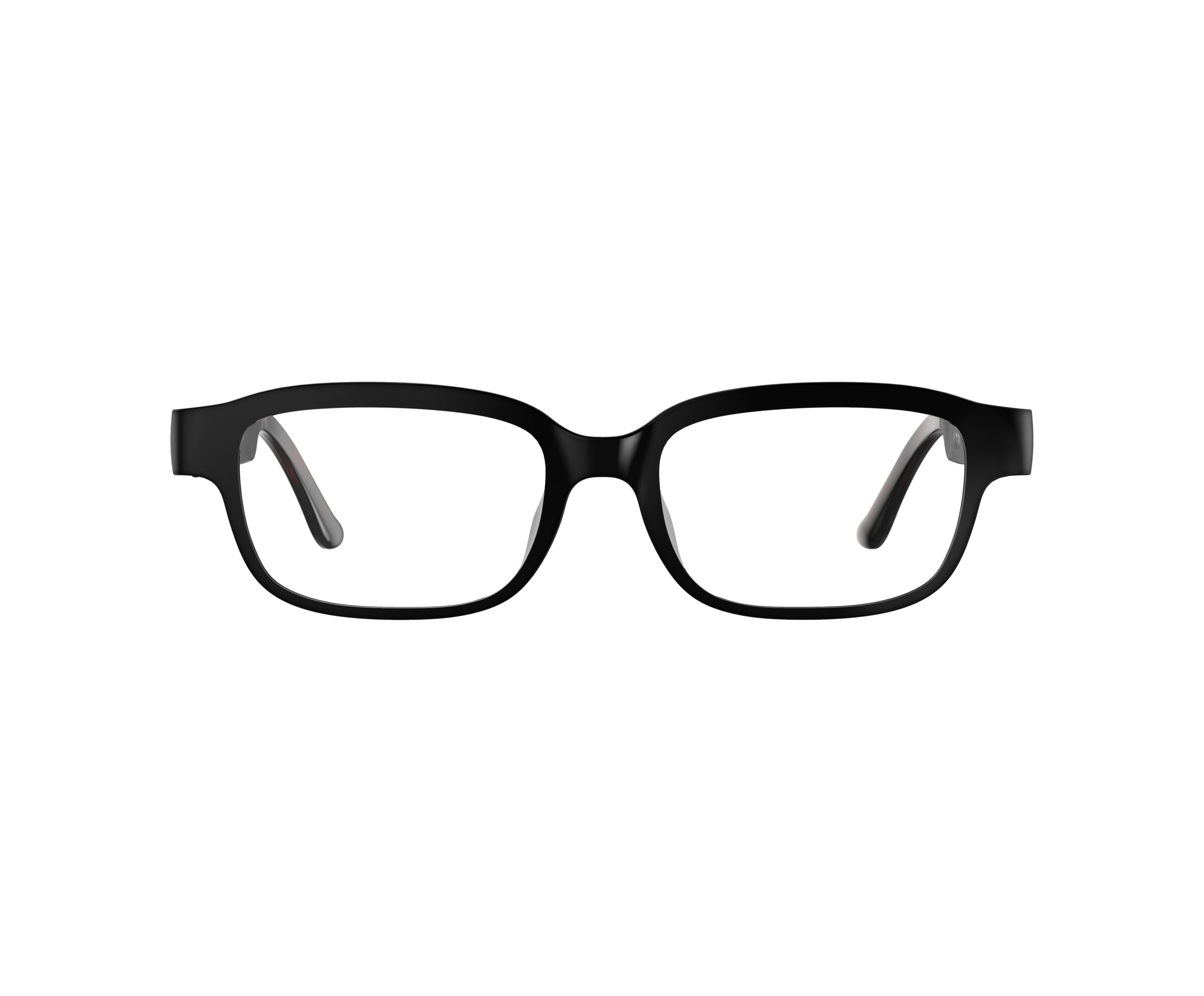
Echo Frames Hardware UX
Project Description
Amazon Echo Frames are an all day wear smart glasses with hands free Alexa. Built and design with the customer in mind, it lets you make phones, listen to media of your choosing, hear to incoming notifications with our VIP Filter feature, and much more; all while still being engaged to the world around you.
Design RESPONSIBILITIES
Hardware UX designer: Interface mapping, learnability and tactility optimization, and hardware prototyping and testing to improve gesture efficacy.
Hardware UX designer: Echo Frames status LED: Visual discoverability optimization, tuning for brightness, and minimizing light leakage and reflection.
Hardware UX designer: Fit and comfort testing
01. / Echo Frames Interface
CUSTOMER INSIGHTS
Customers needed a quick and simple way to control their frames while they are on the go. In order for the customers to learn and retain knowledge on how to use their frames, the controls had to be greatly simplified. This would allow the customer to intuitively react to incoming and on-going audio without overloading the established mental model.
DESIGN CHALLENGES
Creating an intuitive design that is also scalable with additional features in the future.
Touchpad provides versatility however in-field testing we’ve learned that it can also be easily overloaded and accidentally activated.
Feature-to-action prioritization: Features that have high importance but does not fit into touchpad gestures had to have their own gestures on the buttons.
DESIGN SOLUTION
In order for the touchpad to be scalable and intuitive, we’ve limited the gestures to just swipe (bi-directional) for a positive action input, single tap for a negative action input, double-tap to resume media, and long hold for configurable feature. For highly used controls such as volume control, invoke Alexa, and microphone control had their dedicated button gesture.
Swiping the touchpad allows the customer to answer the phone call (positive active), whereas tapping the touchpad allows the customer to decline the call (negative action).
02. / Tactility and Discoverability
DESIGN Challenges
Buttons are too closed to one another and can be easily be easily confused by touch.
Customers gesture within their line of sight which can be outside the touchpad’s active area causing perceived reliability issues.
There is a likelihood of customers false triggering the touchpad (especially for tap and long press).
BUTTON DESIGN Solution
From the gesture efficacy testing, we’ve observed that participants would often enough confuse themselves between the Action Button and the Volume Up button. Although, the gap between the 2 button was designed according to the average thumb width, we’ve learned that majority of the participants uses the gap to differentiate between the buttons and they associate the Action Button (which is in the front) to be the volume up due to its location.
As a solution, I worked with the industrial design and product engineers to conduct a deep dive into different tactile textures to give the action button more pronounced characteristic so that the customer can quickly differentiate the button by touch. In order to validate our design solution, we conducted additional rounds of usability and interface efficacy testing to finalize our design solution.
Using 3D printed buttons and retrofitting them into frames prototypes allowed us to quickly run tactility testing with participants.
TOUCHPAD CHALLENGES
Within beta feedback we’ve learned that: (1) participants found the the touchpad to be too sensitive causing it to false trigger, (2) Tap gestures were not registering, and (3) Quick swipe gestures were being registered as taps by the system.
To dive deep into the problem, I worked with the design research team to reached out directly to each participants (n=23) to run through gesture testing and interviews to pin point and categorize the independent issues.
One of the findings from the interviews:
Touch not responding: One of the leading cause for the touchpad not registering inputs were due two factors: [1] Customers gesturing within their peripherals (line of sight) as a way for them to assure themselves they are tapping on their glasses, [2] Customers leverage the tactility of the metal accent as a physical touch indicator as a target for their inputs. The metal accent rests outside the touchpad active area.
DESIGN SOLUTION
Aligning with the product team, we have concluded the best solution to mitigate for this issue is to increase the awareness of the touchpad location through user education during device setup. Making it clear to the customer of the location of the touch within the controls education video.
Highlighting the touchpad activation area in the setup education video.


